Website ·  About Us ·  Custom ·  Gallery ·  Testimonials ·  Contact

All of our creations are custom designed for each client and are carefully handcrafted works of art. We are highly dedicated to providing you with exceptional customer service, meticulous attention to detail and the upmost in quality invitations and stationery. All of our products are designed using only the finest quality cardstocks and papers, as well as professional adhesives that will stand the test of time. Our stationery is sure to make a memorable first impression, one that will highlight those enchanted moments.

Thursday, 17 January 2013

Wonderful Wedding Show 2013

Wow it’s been a long time since I posted last! This last year has been crazy busy with seeing my sales quadruple! This year has started out to look like my busiest year yet and is booking up fast as well.
      We are off to the Wonderful Wedding Show in Winnipeg tomorrow. Feel free to come on by and say hi! We will be booth #1016. My display this year will be playing off of a vintage romantic feel with colors of rose pink, ivory, gold and silver. I’m really looking forward to it! I will post photos when I get home after the show.
- Ruth Loewen

Monday, 27 August 2012

New Design: Anastasia - Vintage style birdcage with "Love Birds"

        I thought I'd introduce you to my latest work! Meet Anastasia....a classy vintage style invitation. The satin metallic printed layer has a unique smudged look along the edges to give it the appearance of old paper. A pair of blue "love birds" rest on a flowering tree branch as flowers cascade down to the ground. Below them an antique gold bird cage hags with it's door open. On the right is a vintage frame encompassing the wording where I chose several fonts that when together, give the invitation and old look. At the bottom left is the inscription "As petals to a flower, as wings to a bird, as sunrise to morning, so you are to me.". All this is then layered over a bronze metallic cardstock base and the corners are rounded to complete the look of this design. Fully customizable to your choices of text and colors. $3.00 each


Sunday, 1 July 2012

Invitations featuring water color paintings by Ruth Loewen

Coming soon! I will be designing invitations that will feature prints of my very own water color paintings. Invitations featuring my original art work will start at $4.00 each for base and printed layer. Please contact me for pricing on custom paintings made especially for your invitations. Here is a sneak peek at one of the first painting to be featured:

Thursday, 14 June 2012

We now support a charity!

We are so excited to announce that Enchanted Moments is now a proud supporter of Samaritan’s Purse.  As of June 14th, 2012, $5 from every order will be donated to:  
A great charity and ministry that focuses on, and deals directly with international relief efforts, where the need is so great. Together we can make a difference, touching lives and hearts across the globe. For more information about Samaritan’s Purse visit their website at: www.samaritanspurse.ca

Friday, 1 June 2012

Favourite Things

      Over the years designing invitations I have developed a love for particular elements, styles and colours. Here are just some of my favourite things that will perhaps inspire you.  :)

Fonts
     I love fonts! I think just the right combination of fonts can sometimes be just the right thing you need to make your invitation go from "Hmmmm" to "Ahhhhhh!". I would have to say my dream font I have yet to purchase (Poetry font) but for now my favourite of the fancy fonts is:


I think it's just so classy and elegant. Swirls just the right amount without being overwhelming.
    Now for simpler fonts I have a few favourites that I find pair very nicely with fancy script fonts:
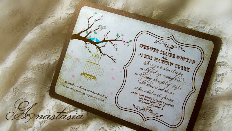
Paper / Cardstock
       For printed layers on invitations, my all-time favourite cardstock is a gorgeous metallic satin finish white. It's smooth texture, vibrant sheen and crisp, clear printing has brought this cardstock to the very top of my list. I have been so happy to see that more and more couples have been choosing this cardstock for their invitations this year, due to it's elegant appeal.


       For invitation base cardstocks, I would have to say that this metallic satin finish Champagne cardstock has won my heart. It is so versatile in that its heavy enough to be an invitation base and yet flexible enough to print on. Print quality result on this paper are also very good. The color is softer and so classy, adds so much to the designs I've used it on.

Ribbon
      Hands down my favourite ribbon of the year is a deep eggplant purple satin ribbon made by Offray (color name Grape). The color is just so deep and rich it's almost intoxicating to look at. Love it, love it, love it!

Embellishments

       It's hard to pick out of the endless options out there but I am going to go with an oval rhinestone and pearl button...so beautiful!
Colors
        Where do I start? There are so many gorgeous color combinations it almost seems like picking a favourite is literally impossible, but alas I have found one combination this year that I think has risen above the rest. I think my other favourites listed above may give you a hint but, my favourite color combo of this year is Deep Eggplant Purple, Champaign and Ivory. Can you get any classier than that? I think it sets a traditional, upscale feel to the wedding. I can just picture: Champaign glasses, crystal, draped ivory sheer fabric with white lights, floating candles in glass vases, deep purple flowers, a stringed quartet playing classical, Champaign satin bridesmaids dresses with eggplant purple sashes…I think you get the picture. Simply stunning....mmm so nice!
     - Ruth Loewen


Wednesday, 14 March 2012

Wedding colors for spring - Apple Green and Coral

          Now that spring is in the air, I thought I’d introduce a new spring wedding invitation design! The color scheme is perfect for spring with splashes of Fresh Apple Green and Bright Coral. I gathered inspiration from the new flowers that will soon be blooming and the fresh green of spring foliage, as nature awakens from it’s winter slumber. I love the way these two colors work together and I think they set an atmosphere that has a crisp fresh feel and yet it adds that touch of warmth by bringing in the coral. Simply delightful!  
          The printed layer on this design is a white cardstock with a very subtle metallic sheen to it. Beautiful Coral flowers softly fade into the background, and at the top is a monogram of the couple’s initials. The front is adorned with small pearls and a band of white satin ribbon. All this is layered over an Apple Green metallic cardstock. 
Invitation by: Enchanted Moments - Invitations & Cards, Flowers by: Snapdragon Studio, Cake by: Linda's Bakery courtesy of EAD, Bridesmaid dress from: The Rose Dress, Wedding dress from: Wedding Dresses Best

Monday, 30 January 2012

Embarrassing moments....

I know we all have them. With doing displays at 2 wedding shows in the last 2 weeks it was sure to happen that I would encounter at least one embarrassing moment and sure enough I did.
         Ok, so the past week or so I’ve had a cold. Not exactly what you would call great timing with wedding shows in tow. I was working my booth at the Wonderful Wedding Show in Winnipeg, and all was going well until suddenly I felt an urge to cough. Trying to avoid sounding like contagious germ carrier I tried to suppress the cough. Well the instant I did that I knew I was in trouble. My eyes began to water and the urge to cough intensified. Just then there were two ladies at my booth who were asking questions about my stationery. As soon as I went to talk I realized that I had also lost my voice. All that came out of my mouth were whispering and squeaks sounds resembling that of a sticky windshield wiper. I cleared my throat repeatedly but to no avail, all the while trying to suppress the growing urge to cough. So there I am, standing there squeaking away with tears flooding from my eyes and streaming down my face. I can only imagine what they must have thought and the incident left me feeling like a blubbering idiot lol. Somehow I managed to answer their questions and then after they left my booth I broke into a strenuous coughing fit.
         Moral of the story: I think us business professionals often put so much emphasis on being “professional” that we forget to display or remember that we, just like anybody else, are human. There is nothing like an embarrassing blunder to put any illusions aside and everything back into perspective. :)
- Ruth